December 2020
I was contracted via Upwork by Curious Office, a product-focused venture lab collaborating with Under Armour, to evaluate the MyFitnessPal mobile app from a UX perspective. MyFitnessPal is one of the most popular health and fitness apps globally, used by millions to log food and track macros, exercise, and goals. This project was a 1-week audit and conceptual redesign engagement, aimed at identifying UX pain points and delivering a clear, actionable proposal for improvement.
1 week
remote
user interviews, Adobe XD
Despite its massive adoption, MyFitnessPal's UX was burdened with bloated navigation and a lack of prioritization for the core food-logging flow. The app was under pressure to evolve with user needs and industry trends, but the product’s current state confused both newcomers and loyal users. Curious Office wanted to evaluate the app’s experience and identify UX and UI opportunities that could boost usability, retention, and premium engagement.
From macro trackers to first-time users
Habitual macro trackers using the app daily for weight or performance goals
Casual dieters trying to build healthier eating habits
Each user expected speed, ease, and personalization, but the app's structure buried key actions and overemphasized secondary features.
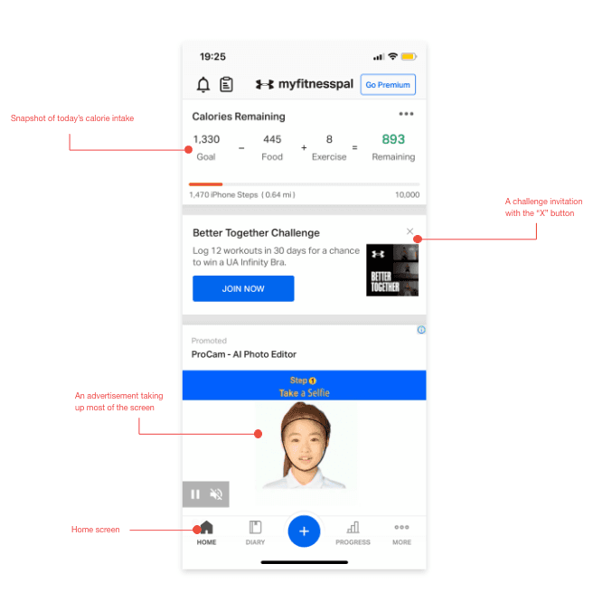
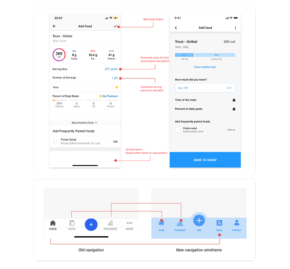
MyFitnessPal mobile app: the user experience BEFORE


A solo sprint — research, design, and delivery in 1 week
This was a fully remote, week-long engagement where I performed the entire audit.
... my responsibilities included:
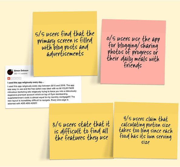
Conducting user interviews (n=5) and usability heuristics evaluation
Analyzing App Store and Trustpilot reviews for user sentiment patterns
Mapping and restructuring the information architecture
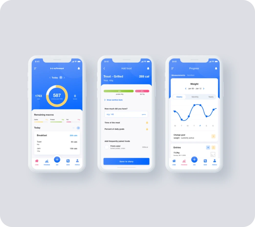
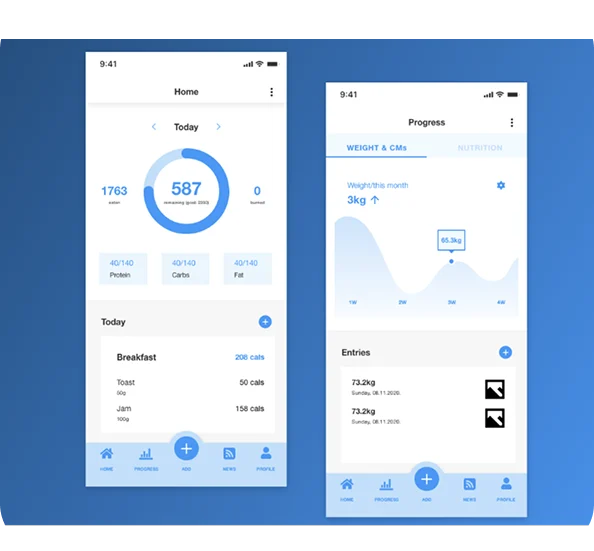
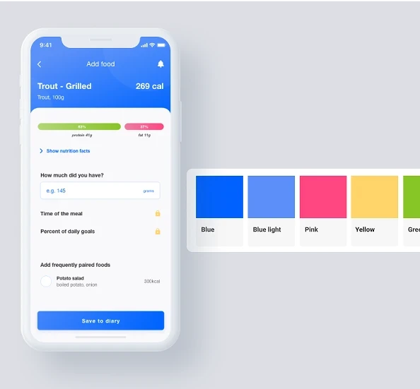
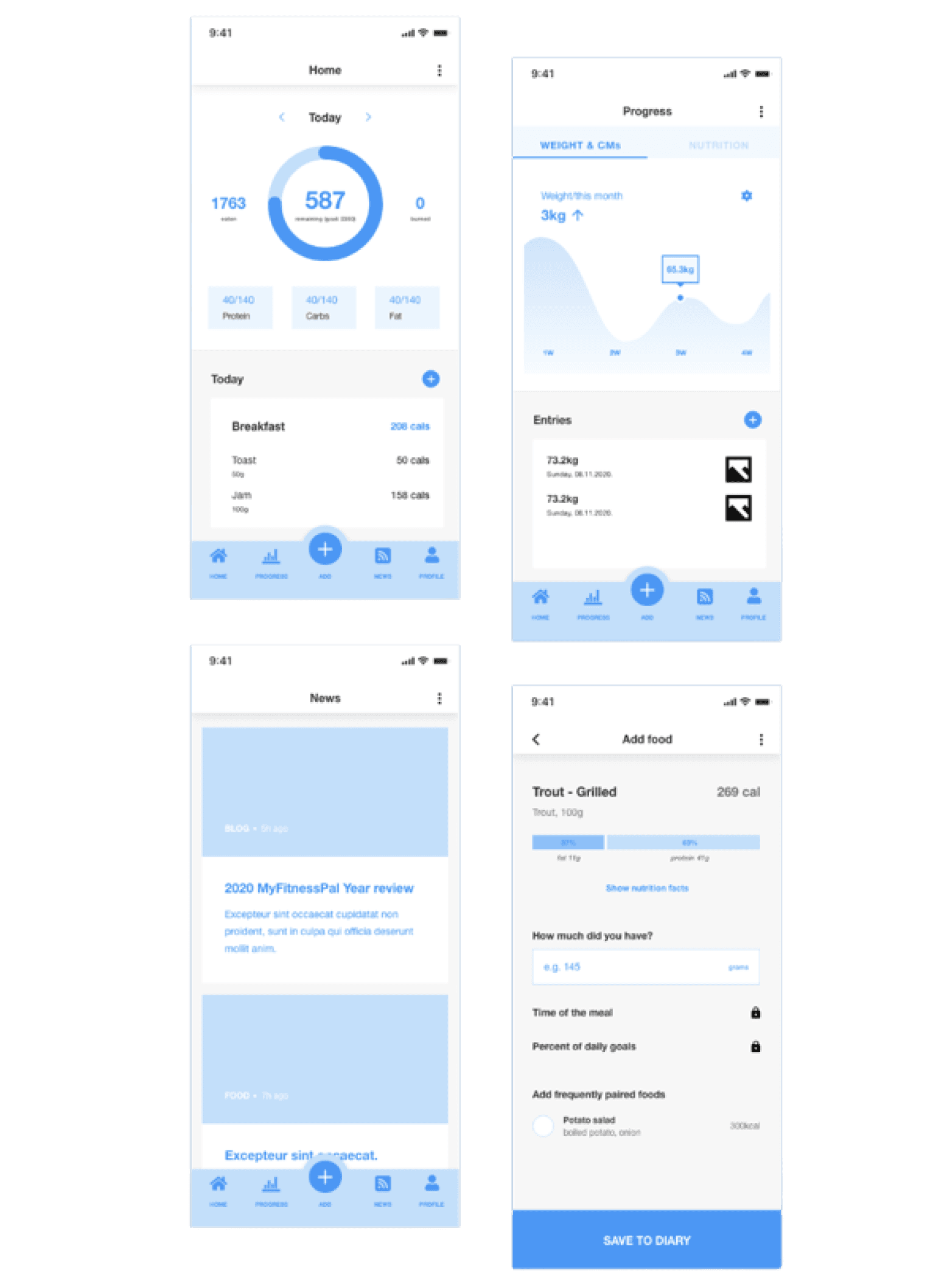
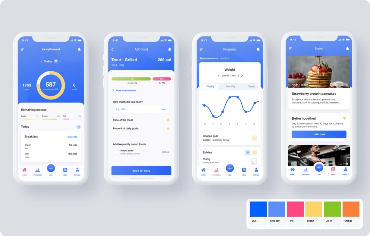
Designing a refreshed mobile UI concept for core screens (Home, Diary, Add Food)
No time to waste — focused output under tight constraints
The scope was intentionally lean: deliver maximum UX clarity within a tight 1-week timeframe. There was no opportunity for extended prototyping or usability testing.
Instead, I focused on clear problem framing, lightweight user validation, and UI concept proposals that could guide Curious Office's product strategy discussions.
User research & Heuristics audit
Too many features and lack of prioritization based on user needs
Discovered through 5 user interviews and recurring UX complaints from 100+ Google Play, App Store and Trustpilot reviews.
Information architecture
Proposed new IA focused Diary, Progress, Feed, Profile
Mapped current structure (8+ primary nav points, inconsistent grouping) into 4 core sections.
UX design
Reorganized key actions around “Add Food” and macro overview
Streamlined bottom navigation to prioritize logging and progress, while de-emphasizing secondary content like blog posts and ads.
UI design
Emphasized clarity, whitespace, and visual hierarchy
Through applying calm, vibrant, brand-aligned visuals.
From bloated to focused: redesigning the user journey around what matters most
Identified three major IA bottlenecks responsible for key user frustrations.
Delivered a refreshed navigation concept that simplified access to core flows (Diary, Add Food, Progress).
Proposed visual hierarchy improvements praised by stakeholders for aligning with modern app standards.
The audit was used to frame product direction discussions in Curious Office’s follow-up meetings with client stakeholders.
Clarity comes from focusing on the highest-impact changes
While more user testing would be ideal, small inputs from real users + reviews still create actionable clarity.
Visual improvements work best when backed by architecture fixes. Whitespace and colors help, but navigation defines the experience.
For legacy-scale apps, it’s rarely about inventing new UX - it’s about re-centering what matters most for the majority of users.