January 2024 - April 2024
At Ramo, a Web3 infrastructure company focused on decentralized storage, we identified high user drop-offs during staking transactions. I led the UX effort to redesign the staking flow, reframing the experience from a technical blockchain operation into a transparent, trust-building financial journey across web and mobile devices.
team of 5
sole UI/UX designer
Figma, Posthog

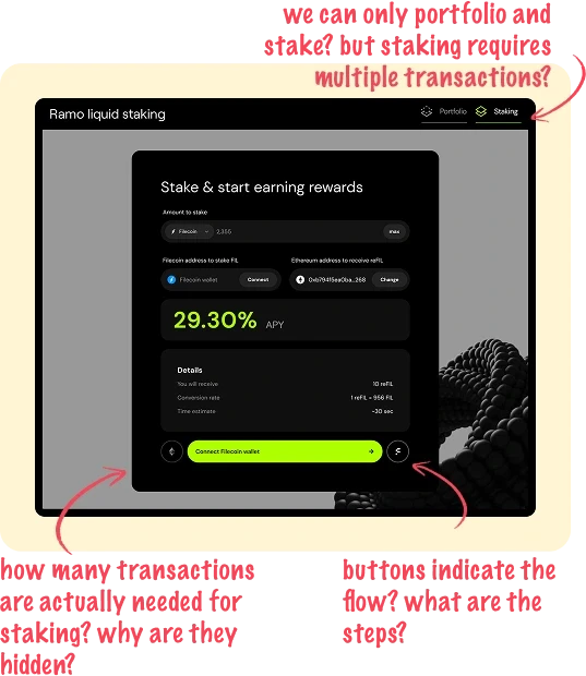
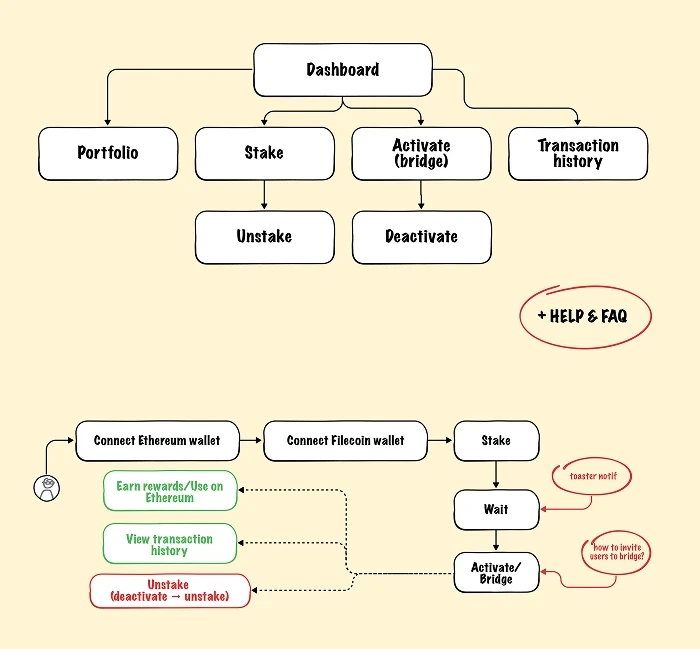
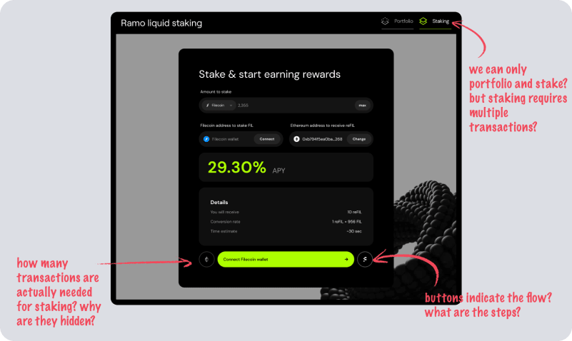
The multi-step staking process was difficult for users to understand and complete. Key actions lacked visual confirmation, transaction status was hidden, and the navigation was unintuitive. These challenges resulted in frustrated users abandoning staking mid-process, leading to lost engagement and revenue.
Crypto-savvy investors seeking reliable staking tools
Our users ranged from individual crypto investors passionate about decentralization to institutional Filecoin stakeholders managing large token portfolios.
They were technically informed but expected professional-grade financial UX: clear, transparent, and friction-free.
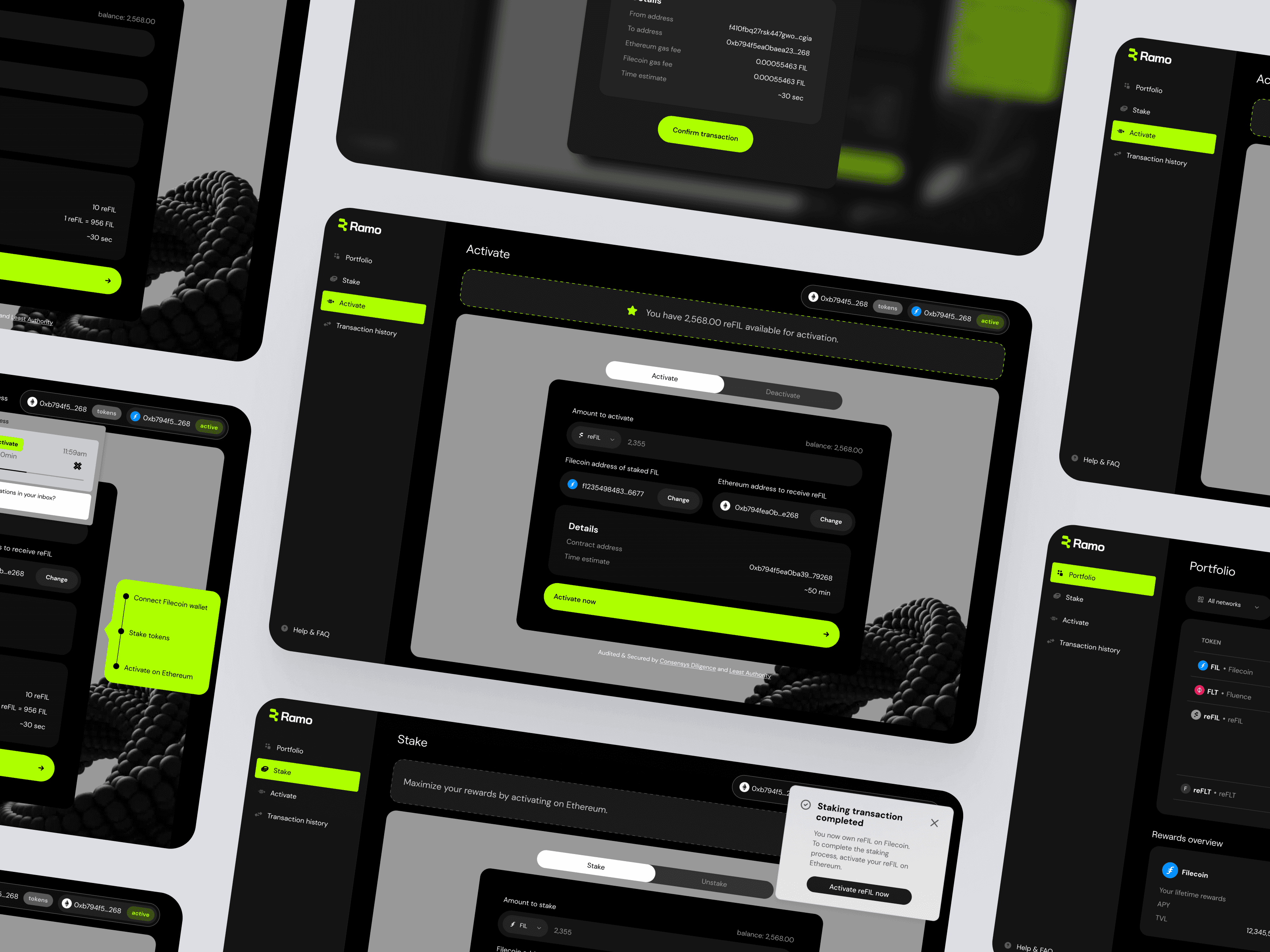
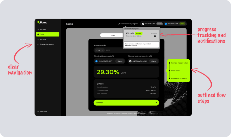
Staking: BEFORE
Solo UI/UX designer collaborating with product and engineering
I served as the sole designer, working remotely alongside a Product Owner, two Backend Engineers, and a Frontend Engineer.
... my responsibilities spanned:
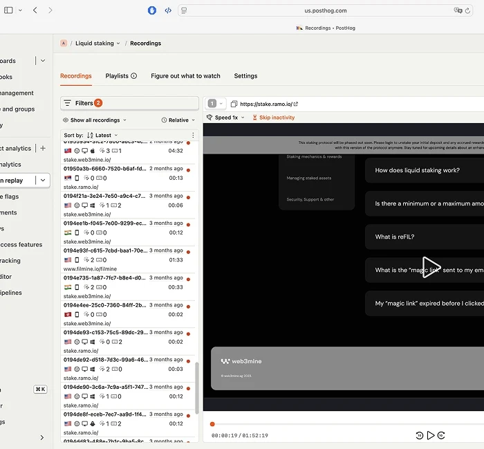
Analyzing user behavior through PostHog.
Redefining information architecture and navigation.
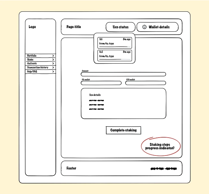
Designing new transaction feedback flows.
Delivering high-fidelity web and mobile UIs.
Supporting frontend development and QA during implementation.
Delivering a UX upgrade without overhauling the backend
One key constraint was a backend-first development culture: complex transaction logic was fixed, and design changes needed to layer improvements over existing processes. The project operated on a 3-month timeline, requiring lean, high-impact UX upgrades rather than full system redesigns.
... key questions:
What trade-offs are we willing to make between implementing cutting-edge technology and maintaining solid user experience practices?
How do we communicate the technical complexities to users in a way that is clear and accessible, without overwhelming them?
User research
Analyzed 6+ hours of user session recordings
To identify when exactly users drop off and which part of the original UX seems unclear. Conducted 7 targeted post-release user interviews.
Emphatize & Synthesize
Understood users’ needs and technical constraints
Mapped out new IA: separating Stake, Portfolio, Bridge into distinct areas.
Design
Redesigned key flows for better clarity
Introduced visual transaction tracking with dynamic status updates. Added in-app and email notifications for critical transaction events.
Handoff & Support
Supported FE implementation + ad-hoc design changes
Provide continuous feedback regarding the UI implementation, participate in QA.
Staking: BEFORE
Staking: AFTER
Interactive prototype
HTML/CSS prototype used for stakeholder presentations and testing
Higher completion rates, happier users, fewer support tickets
7/7 interviewed users reported greater confidence using the platform.
5/7 users were able to complete staking processes without external help.
Slack support queries related to transaction confusion dropped notably.
Stakeholder feedback highlighted the transaction tracker as a major trust booster.
This project demonstrated how strategic UX design can solve deep trust issues in complex financial flows - even under tight technical constraints.
When designing financial trust under technical pressure
Transparency is critical in financial UX: users must always know where they stand.
Progress feedback reduces anxiety and support load simultaneously.
Collaborating closely with backend teams early in the process prevents late-stage design compromises.